My chosen outstanding webs
In this project, I have personally selected one website per awarder from among the nominees and honored ones. Each chosen site reflects a combination of design elements and features that resonate with my own design preferences. Through this analysis, I will delve into the key reasons why these websites stand out for me, discussing aspects such as visual aesthetics, user experience, navigation fluidity, and overall design harmony. By reflecting on what I find particularly inspiring or effective, this exploration aims to provide a thoughtful critique of what makes these websites exemplary within the broader context of web design today. These evaluations are based on my personal perspective as a designer, highlighting what I believe sets these sites apart in terms of creativity, usability, and how they capture the essence of modern design.
AWWWARDS. THE DESIGNERS CLUB
The Designer’s Club has a minimalist yet elegant approach. It immediately captivates with a clean, sophisticated aesthetic that speaks directly to its target audience: creative professionals with a refined eye for design. The minimalist color palette, predominantly neutral tones, combined with subtle yet effective use of contrasting colors for highlights, enhances the overall sense of elegance and professionalism. This design choice avoids distractions, allowing the content to shine while maintaining a calm, polished appearance. The generous use of white space adds to the site's breathable, modern feel, providing users with a sense of clarity and openness.
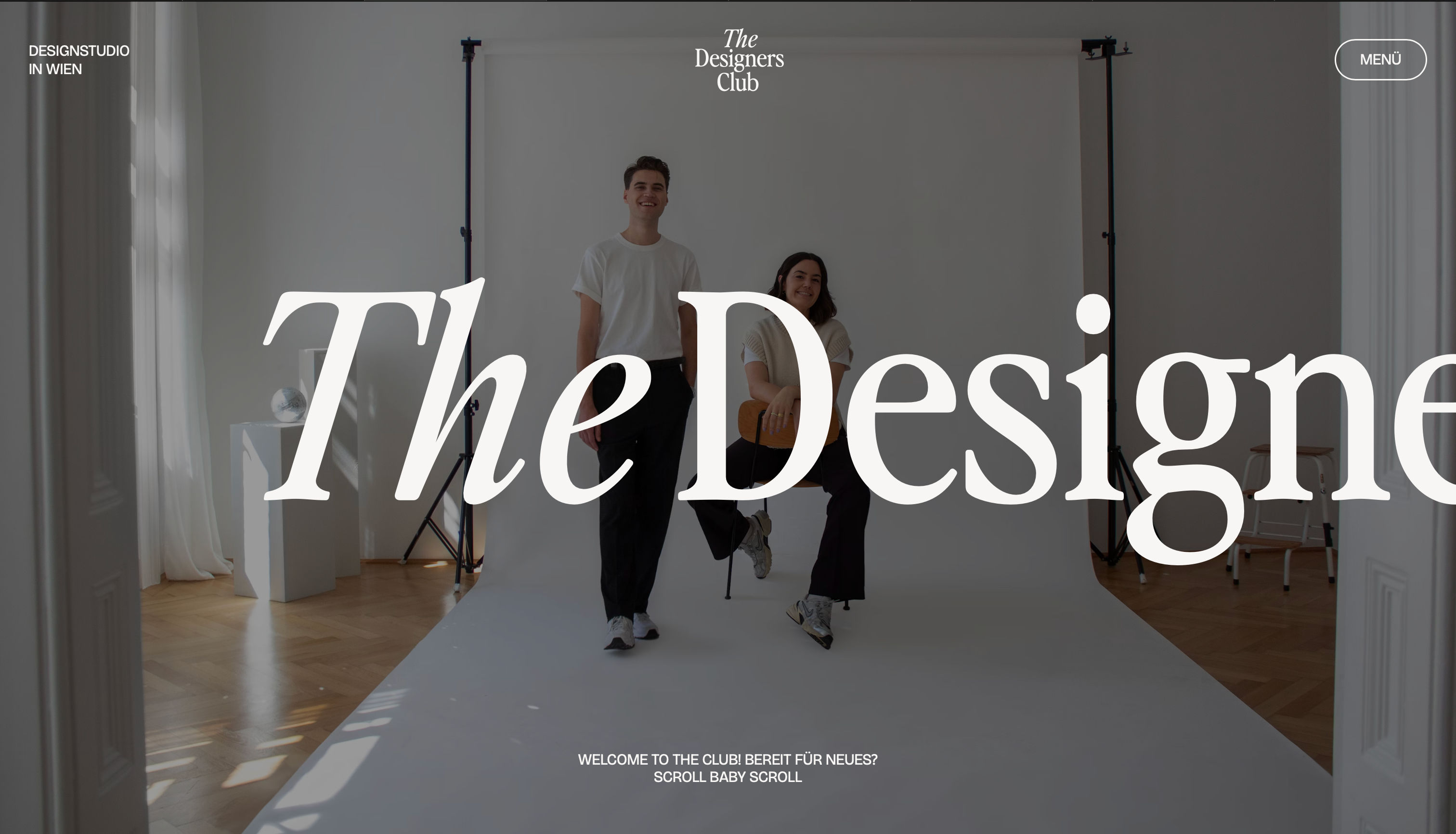
From a UX perspective,
the site’s navigation is simple and straightforward, allowing users to move between sections without
confusion. The primary navigation menu is clear, with concise labels that guide the user efficiently
through the site. The overall structure is well-organized, minimizing cognitive load by keeping the
layout clean and content easy to digest.
The site also integrates smooth transitions and
hover effects that enhance interactivity without being overly complex or distracting. These subtle
animations contribute to the sense of fluidity,
making navigation feel effortless and enhancing the overall user experience.
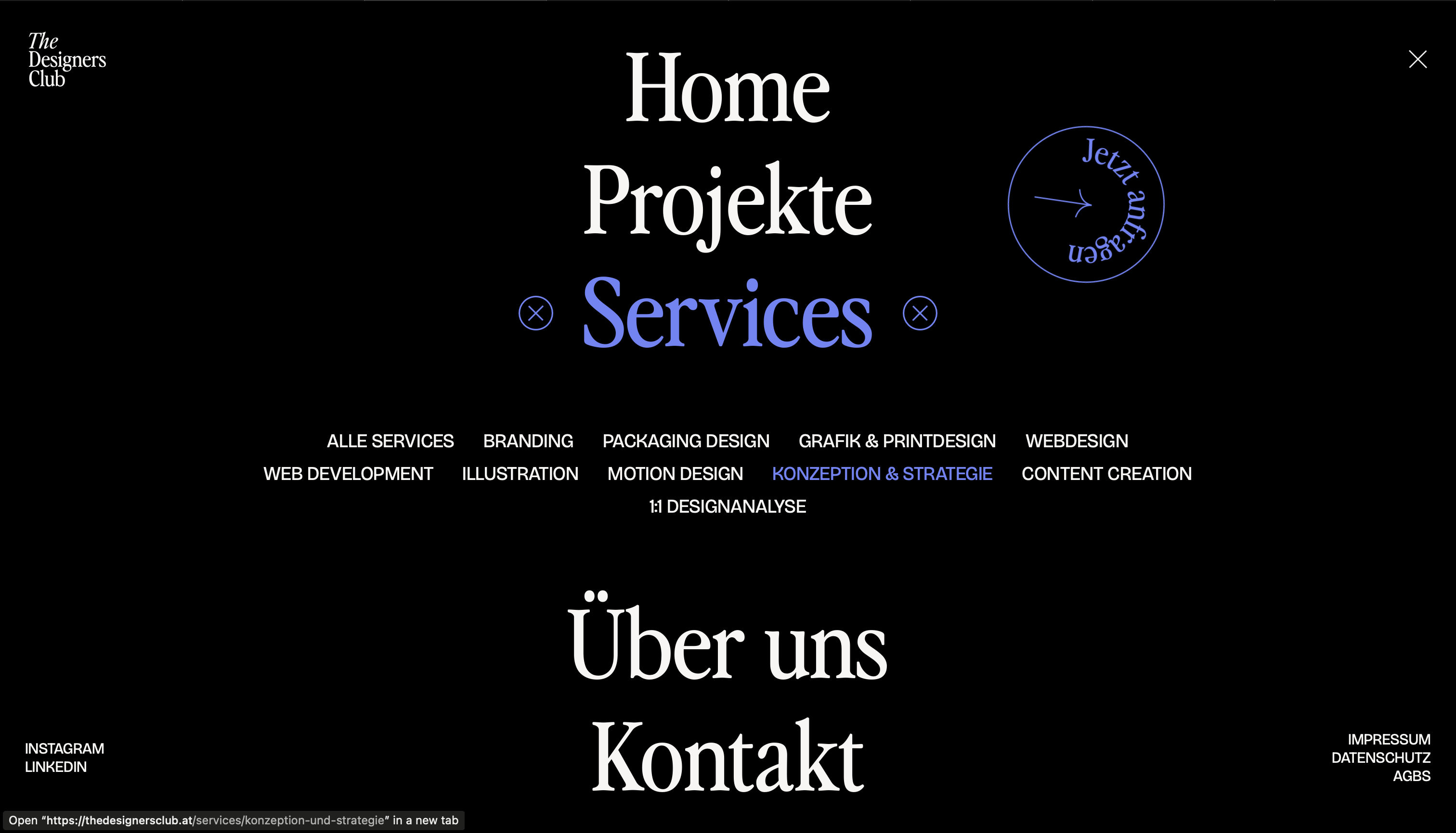
One of the key strengths of The Designer's Club is its ability to convey a strong, cohesive brand identity. Every design choice—from the color scheme to typography and layout—supports the brand’s message of elegance, exclusivity, and modernity. The site is clearly positioned as a premium resource for designers and creative professionals, and the consistency across all sections builds trust and recognition for the brand.

The alignment of design principles—simplicity, elegance, and functionality—makes this website a
standout example of how less can indeed be more in web design.
WEBBYAWARDS. ANTON & IRENE
The design of Anton & Irene's website is a clear example of how visual aesthetics can be effectively used to tell a story. From the moment a user accesses the site, they are greeted with a presentation that uses bold typography and great visuals, creating a dynamic visual experience. The use of strong, contrasting colors combined with large, well-designed graphics gives the site a unique personality, breaking away from traditional standards and emphasizing its creative and innovative character.
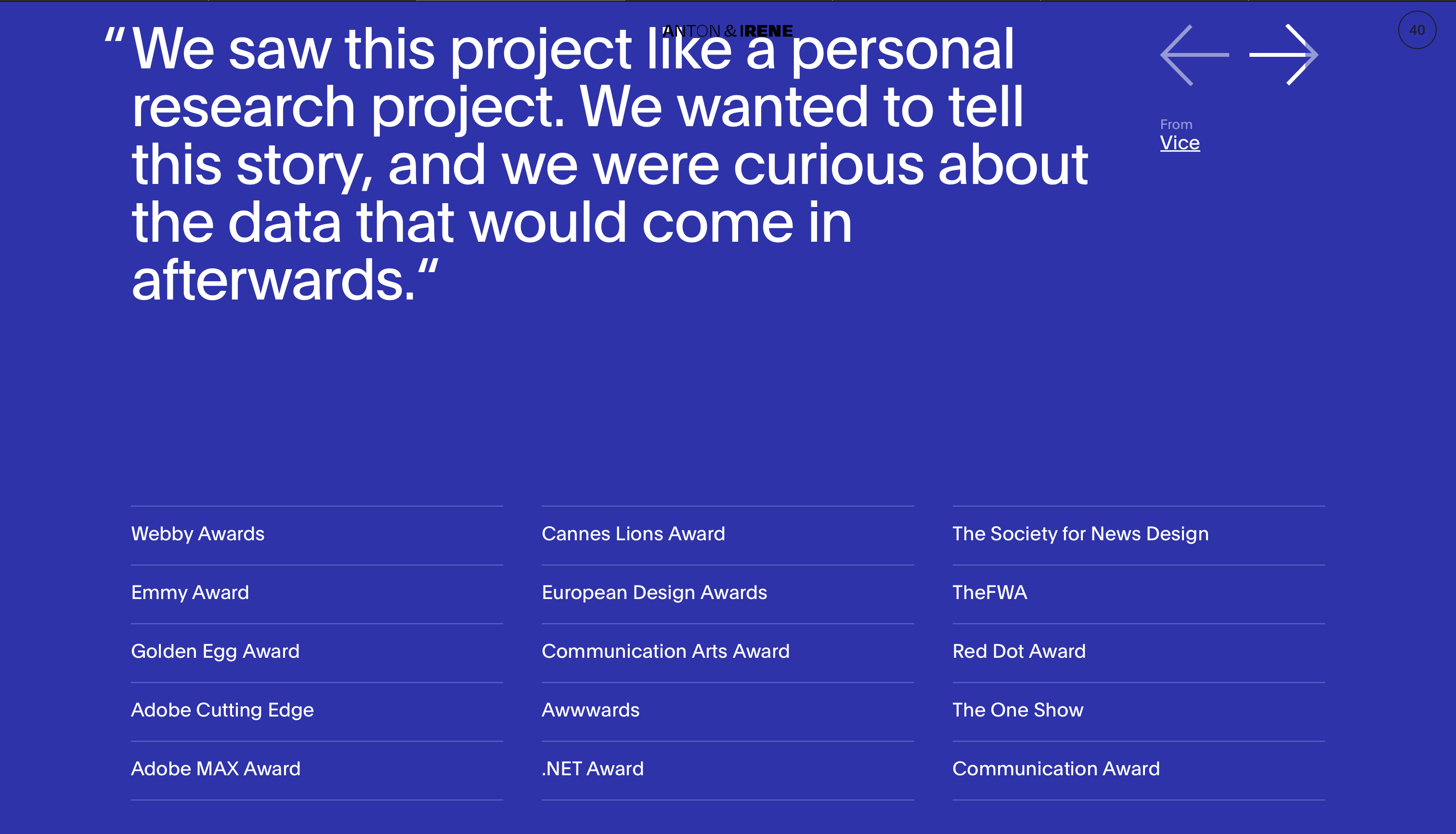
One of the most outstanding features of the site is the typography choice. Anton & Irene have opted for large, visually impactful typefaces that align with the brand’s personality: bold, creative, and unconventional. The headings are commanding and immediately draw attention, while the smaller texts are easily legible. The blend of large typography with smaller body text provides an interesting visual balance and reinforces content hierarchy. Additionally, typography plays a crucial role in the storytelling.

One of the most notable aspects of Anton & Irene is their innovative use of interactivity and animations. The site is filled with subtle scrolling effects and smooth transitions that create a sense of continuity and fluidity while browsing. These animations are not merely decorative but serve to intuitively guide the user through the story. For instance, scrolling triggers movement in certain graphical or textual elements, making the user feel like an interactive part of the experience. Moreover, these animations are perfectly integrated into the design without hindering navigation or slowing down the page load, showcasing an advanced understanding of balancing visual design with functionality.

The site’s structure is particularly clever, as it doesn’t follow a conventional “standard menu”
layout. Navigation is fluid and experimental, which makes the user experience more immersive.
Instead of a fixed menu, the site utilizes a page design that encourages the user to continuously
explore, as if it were a never-ending story. Even though the navigation is unconventional, it
remains intuitive.
Instead of showing traditional portfolios, they opt for narrative-driven, detailed
descriptions of each project. Its unique interactive experience makes it an outstanding example of
what
can be achieved when creativity meets functionality.
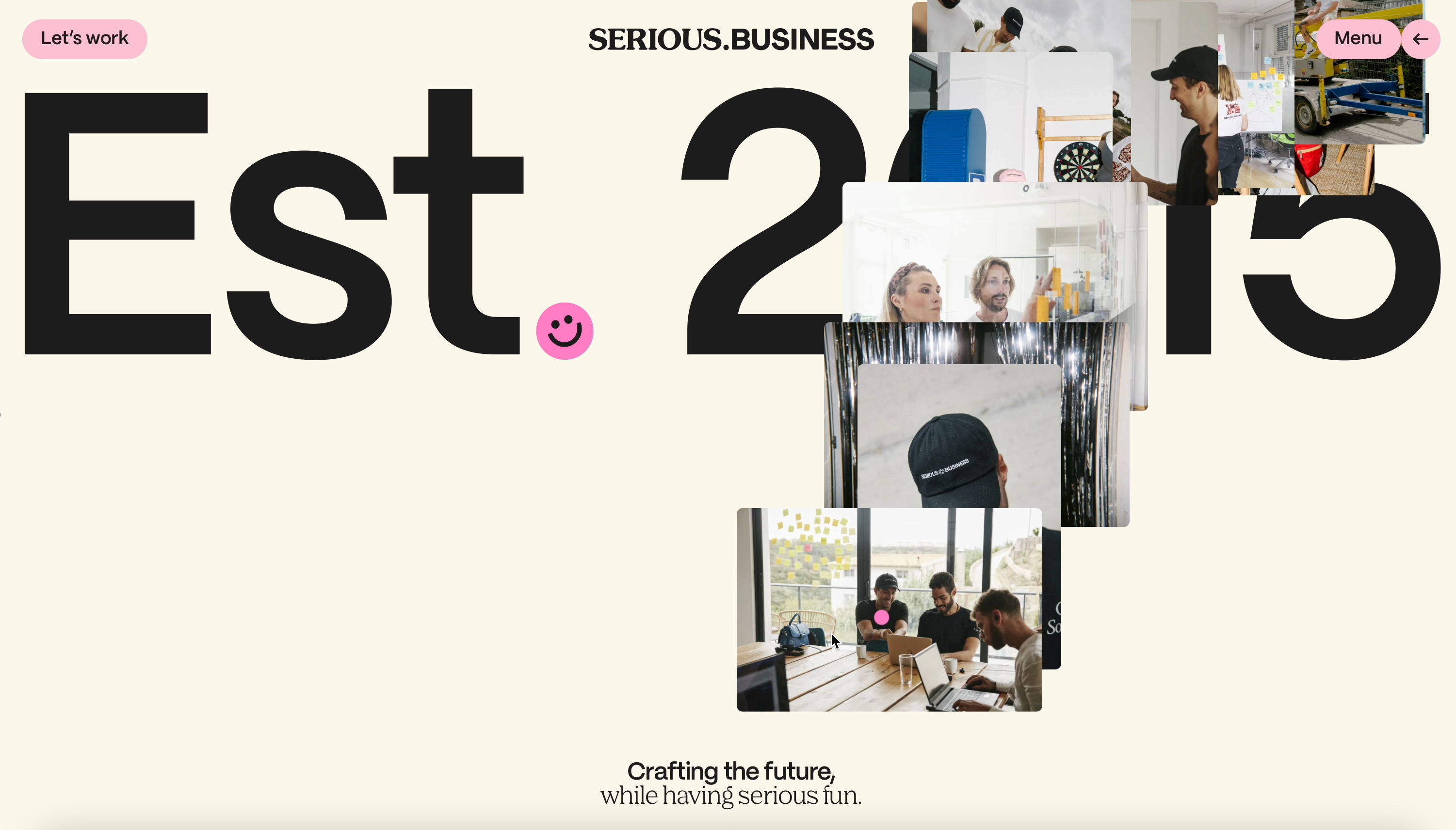
THEFWA. SERIOUS.BUSINESS
The Serious Business website is a prime example of how modern web design can be both innovative and functional. Its bold within a colorful aesthetic, coupled with playful interactivity. The home page is dominated by large, blocky text paired with ample white space, which gives the design breathing room and ensures clarity.

The choice of typography is striking — the oversized fonts create a dramatic visual impact, drawing the user's focus towards key elements like the company’s identity, services, and messages. The size variation between headings and body text immediately directs the user’s attention to the most important parts of the content. The oversized text is not just for aesthetic purposes; it serves as a functional tool for communicating the brand’s personality — bold, direct, and confident.
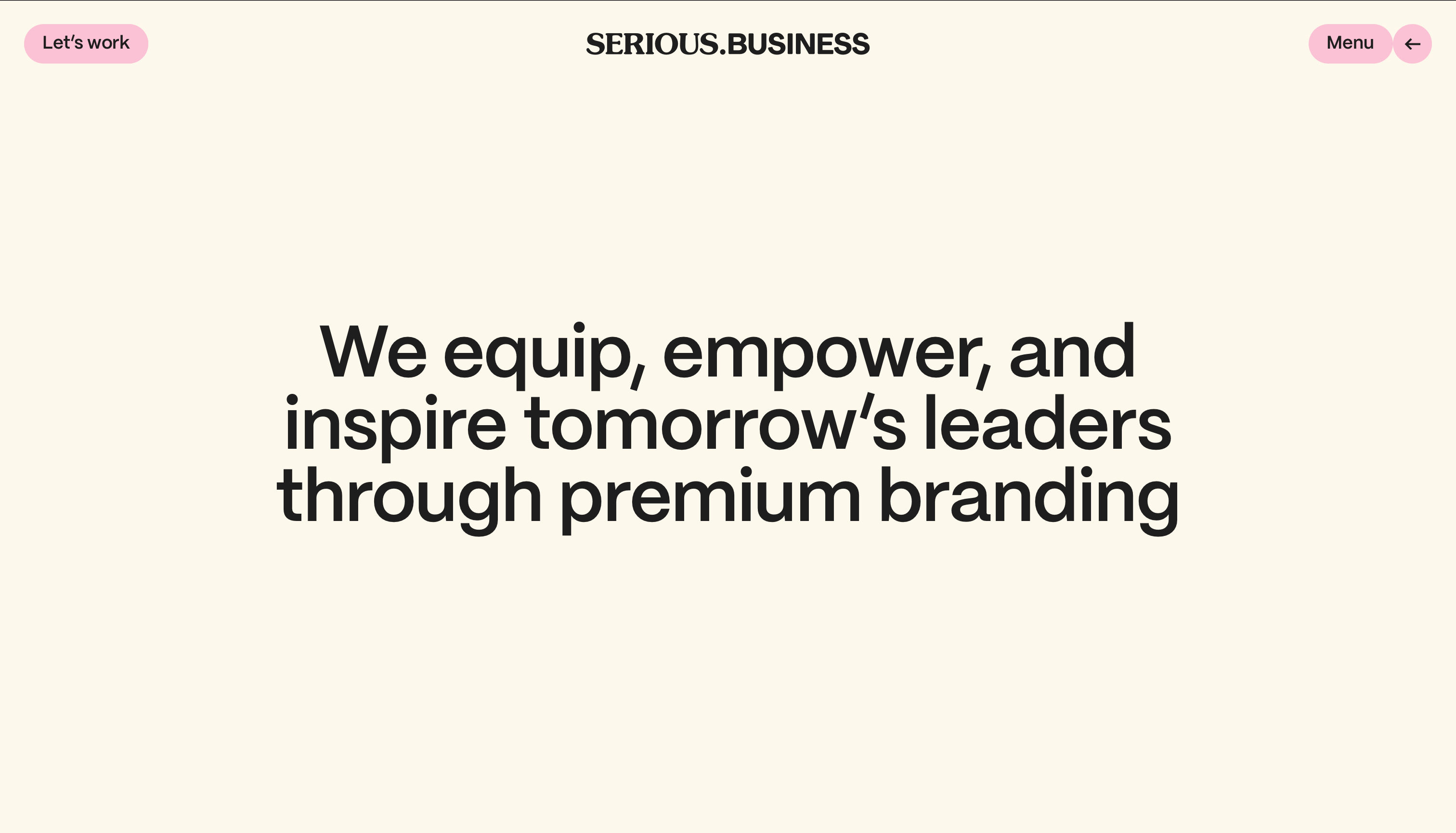
Moreover, the playfulness in layout design reinforces the creative nature of Serious Business,
allowing the
site to feel fresh and modern without compromising user experience. The site includes animations
that bring energy to the experience. Subtle hover effects, animated transitions between sections,
and dynamic content changes keep the user engaged throughout their visit.
They convey a lot with very little text, using concise, impactful statements. The tone of
the copy is confident and somewhat cheeky, which complements the overall aesthetic and appeals to a
creative, professional audience.
Their use of multimedia, including images, videos, and dynamic elements, helps to immerse the user in their creative vision and the branding throughout the site is extremely consistent.
Visit WebsiteCSSDESIGNAWARDS. YAMA MATCHA
The website immediately stands out for its clean, minimalistic aesthetic. The layout is designed to be visually soothing, reflecting the calm and ceremonial aspects of matcha tea. The images used are crisp and high-quality, with a focus on the product and its natural origins.

The use of white space throughout the design adds to the elegance and simplicit and so does the typography. The typography on the site is carefully selected to maintain elegance and legibility. The use of clean, sans-serif fonts for headings and body text creates a modern and professional feel. There's a consistent hierarchy throughout the site. Therefore, the simplicity of the typography enhances readability without detracting from the serene visual experience.

The navigation combines vertical and horizontal scrolling. This brings originality and creativity to the website and the user journey. this, together with the clean and neat aesthetics, makes for a fluid, intuitive user experience that is different from other informative websites.

What I liked most of all is the architecture of the information, and the distribution of it in an orderly, rigid and professional structure where the dynamism and fun is provided by the micro-interactions and transitions.
Visit Website